Is Your Curve Tall, Flat and Wide?
A tale of two very similar plants with very different performance.
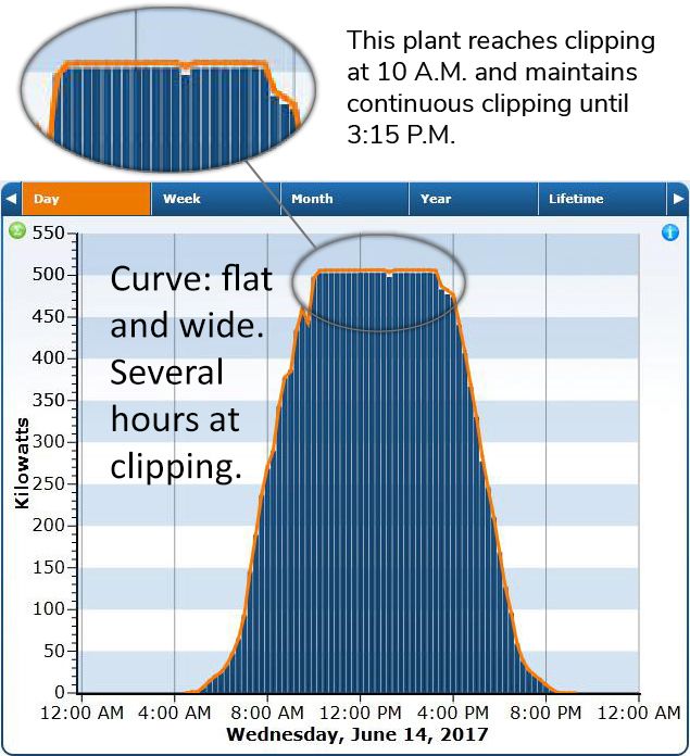
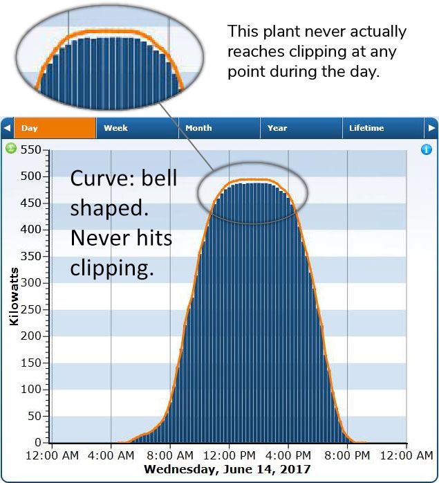
The curves below were extracted from one day during the assessment week and speak to two different curves.
Plant 1

The graph above suggests Plant 1 is healthy.
Plant 2

When compared to Plant 1, this graph above suggests Plant 2 is in need of O&M.
Facts:
- Both plants are owned by unrelated entities.
- Both plants are located in the same geographic area.
- Both plants are 500 kW.
- For a one week period in June, plant 1 was exposed to 44,375 watts/meter squared – irradiance. Plant 2 for the same period was exposed to 44,757 watts/meter squared – irradiance. A difference of only 0.85%.
- Output for Plant 1 was 25,672 kWh or 0.574 kW for every watt/meter squared of available irradiance.
- Output for Plant 2 was 22,951 kWh or 0.540 kW for every watt/meter squared of available irradiance.
- Plant 1 out produced Plant 2 by 6.3%. Even though the difference in available irradiance was only 0.85%.
- Monetized with a power factor of $0.19, Plant 1 generated $326.99 additional revenue in one week over Plant 2.